C# WINDOWS MAUI專案 製作 BadgeButton(提醒按鈕)
C# WINDOWS MAUI專案 製作 BadgeButton(提醒按鈕)
GITHUB: https://github.com/jash-git/MAUI_WinAPI_Object_test/tree/main/Code/21
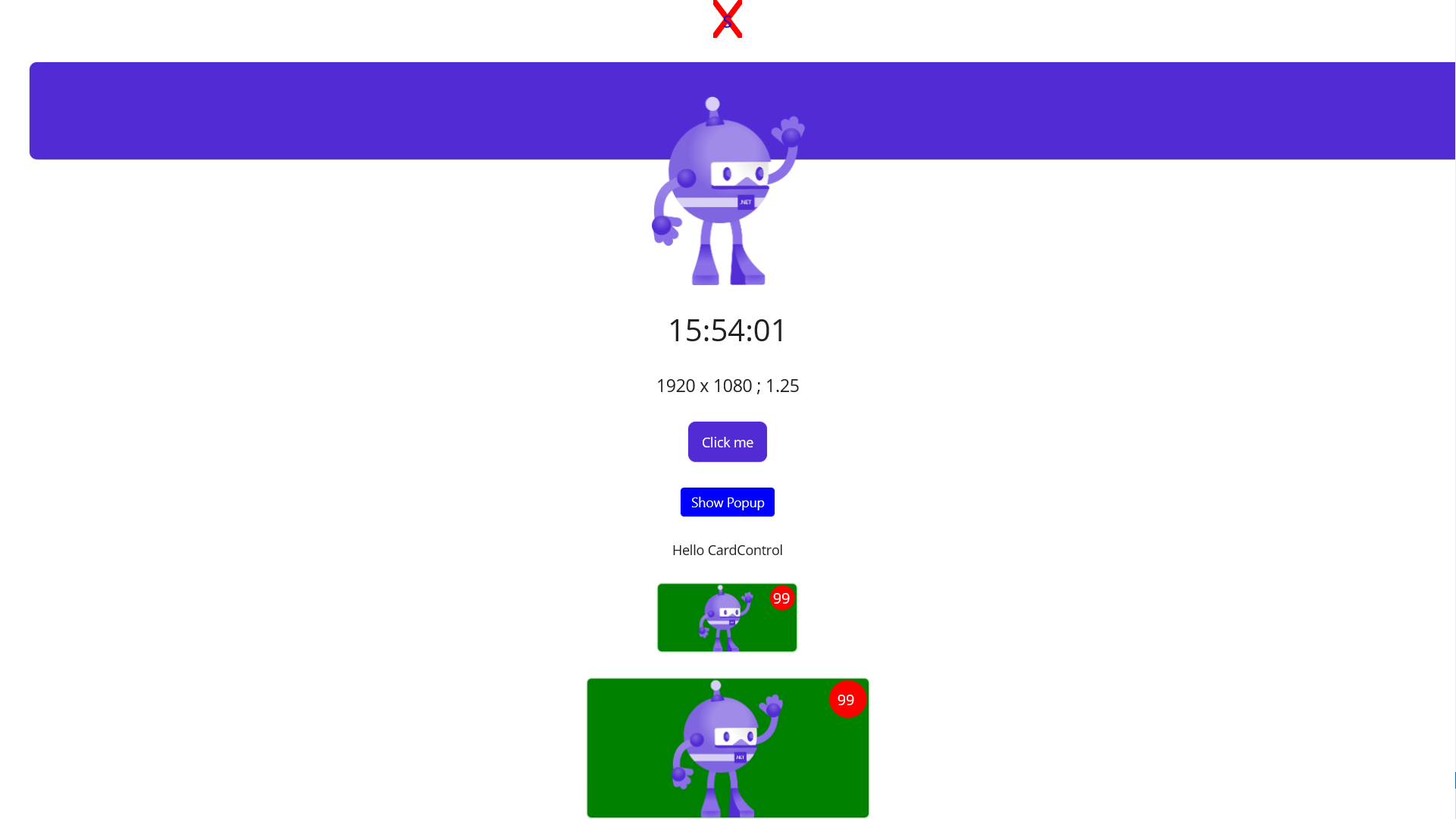
元件設計思路:
01.利用 GridLayout 建立一個單一儲存格的限制
02.Image載入底圖
03.疊加上BoxView繪製出來的圓形
04.疊加上Label的提醒文字
BadgeButton.xaml
<?xml version="1.0" encoding="utf-8" ?>
<ContentView xmlns="http://schemas.microsoft.com/dotnet/2021/maui"
             xmlns:x="http://schemas.microsoft.com/winfx/2009/xaml"
             x:Class="MAUI_WinAPI_Object_test.CustomControls.BadgeButton" SizeChanged="ContentView_SizeChanged">
    <Border x:Name="Frame"
        Stroke="White" StrokeThickness="1" BackgroundColor="Green"
        MinimumWidthRequest="40" MinimumHeightRequest="45"
        HorizontalOptions="Fill" VerticalOptions="Fill">
        <Border.StrokeShape>
            <RoundRectangle CornerRadius="5,5,5,5" />
        </Border.StrokeShape>
        <Grid x:Name="FullGrid" RowDefinitions="*" ColumnDefinitions="*" Padding="0,2,2,0" >
            <Image x:Name="BaseImage" Grid.Row="0" Grid.Column="0" BackgroundColor="Transparent"
                   HorizontalOptions="Center" VerticalOptions="Center"/>
            <BoxView x:Name="CircleBoxView" HorizontalOptions="End" VerticalOptions="Start"
                   Color="Red"  BackgroundColor="Transparent" WidthRequest="26" HeightRequest="26" CornerRadius="13"/>
            <Label x:Name="BadgeLabel" Grid.Row="0" Grid.Column="0"
                   Text="99" FontSize="Micro" TextColor="White" BackgroundColor="Transparent"
                   HorizontalOptions="End" VerticalOptions="Start" Margin="0,3,5,0"/>
        </Grid>
    </Border>
</ContentView>
BadgeButton.xaml.cs
using Microsoft.Maui.Controls;

namespace MAUI_WinAPI_Object_test.CustomControls;

public partial class BadgeButton : ContentView
{
	public BadgeButton()
    {
		InitializeComponent();
        BaseImage.Source = ImageSource.FromFile("dotnet_bot.png");
    }

    private void ContentView_SizeChanged(object sender, EventArgs e)
    {
        double widthRequest = WidthRequest;
        if(widthRequest > 150)
        {
            CircleBoxView.WidthRequest = 40;
            CircleBoxView.HeightRequest = 40;
            CircleBoxView.CornerRadius = 20;
            BadgeLabel.Margin=new Thickness(0, 10, 13, 0);
        }
    }
}